The Power of Composition with CSS Variables
Many frontend developers tend to overlook how powerful CSS can be. I was one of those who would always consider everything else in my toolkit before considering that CSS alone could handle a specific task.
Then, while revamping my blog's theme a few weeks ago, something clicked.
I stumbled upon this pattern of composing CSS partial values for my HSLA colors, assign them to variables. Thanks to this, I was able to build my fairly complex theme and a full color palette that made sense for my websites by only using CSS. No ThemeProvider. No weird CSS-in-JS tools or hacks. Just plain old CSS. Moreover, it integrated perfectly with my existing React/CSS-in-JS setup and helped me declutter quite a few lines of style spaghetti code.
Curious to learn more? Let's take a look together at these patterns and get a peek at some CSS awesomeness ✨
Building good CSS habits by using CSS variables and HSLA colors
Overreliance on ThemeProviders to manage my themes and colors
As said above, CSS itself, whether it was plain or CSS-in-JS, was never really a priority to me. I would put all my attention to build nice scalable code on the Javascript side of things, while CSS would be sole to "make things" pretty. My CSS code was always a mess! Duplicate styles, no CSS variables, hardcoded colors, you name it!
I was very reliant on CSS-in-JS, my ThemeProvider, and interpolation functions to solve these problems for me. I started to clean up my act after reading Use CSS variable instead of React Context from Kent C Dodds. I removed my JS-based theme and solely relied on a plain CSS file to inject my variables.
Example of using theme via interpolation function vs CSS variables in styled components
1// Before I was constantly using JS based theme with interpolation function:2const MyStyledComponent = styled('div')`3background-color: ${(p) => p.theme.primaryColor};4color: ${(p) => p.theme.typefaceColor1};5`;6// Now I, for anything theme related,7// I simply used CSS variables that are defined in a global CSS file:8const MyStyledComponent = styled('div')`9background-color: var(--primaryColor);10color: var(--typefaceColor1);11`;
A mess of HEX and RGBA
It's at this moment that it hit me: I had defined tons of colors in both HEX and RGBA format and... it was a pretty big mess to be honest with you.
Excerpt of the set of CSS variables I had defined in both RGBA and HEX format
1--main-blue: #2663f2;2--secondary-blue: #0d4ad9; /* main blue but 10% darker */3--main-blue-transparent: rgba(438,599,6242,70.18); /* main blue but with opacity 10% */
I would define my colors in HEX format, then if I needed to add some opacity to them I'd completely redefine them in RGBA. Thus I ended up with 2 related colors, very close to each other, written in 2 different formats that made them look nothing alike when reading the code 😱.
While I could switch to use RGBA for all my colors, there was yet another problem. I wanted to generate a proper color palette for all my colors, and managing 10 shades of blue in RGBA is difficult: each shade of blue felt completely disconnected from one another when written in RGBA.
Excerpt of the set of CSS variables I had defined only in RGBA format
1--main-blue: rgba(38, 99, 242, 1);2--secondary-blue: rgba(13, 74, 217, 1); /* main blue but 10% darker */3/*4Despite having everything in the same format the value of --secondary-blue5seem completely different from --main-blue, even though the colors are very close6from one another7*/8--main-blue-transparent: rgba(938,1099,11242,120.113); /* main blue but with opacity 10% */
After bringing this up to some designer friends, they gave me the first tip that made the pattern I'm going to introduce in this article possible: use HSLA.
HSLA stands for Hue Saturation Lightness Alpha channel: the four main components necessary to define a color. The hue comes from a palette of 360 colors defined from a color wheel where each degree of the color wheel is a color. The saturation, lightness and, alpha channel properties are defined in percent (%) and represent respectively:
- the vibrance of the color: 0% is the least vibrant, 100% is the most
- the lighting intensity: 0% is the darkest, 100% is the lightest
- the opacity: 0% is transparent while 100% makes the color completely visible.
I made this little widget below for you to tweak and play with so you get a full understanding of how each property of an HSLA affects the resulting color.
background-color: hsla(222, 89%, 55%, 100%)If we rewrite the shades of blue we mentioned in the code snippets above but this time in HSLA, you can immediately notice that it's way easier to tell that these colors are "close" to each other:
Excerpt of the set of CSS variables I had defined in HSLA format
1--main-blue: hsla(222, 89%, 55%, 100%);2--secondary-blue: hsla(222, 89%, 45%, 100%); /* main blue but 10% darker */3/*4Here our --secondary-blue color is more readable and you can see that it shares5the same hue and saturation as --main-blue, thus making it easy for us to identify6similar colors by reading the value of CSS variables!7*/8--main-blue-transparent: hsla(9222,1089%,1155%,1210%13); /* main blue but with opacity 10% */
However, we can see that defining a whole series of HSLA colors can quickly feel repetitive, and that similar colors share the same hue and saturation. So it's at this moment that I wondered: What if we could somehow define just a part of the hue and saturation through a CSS variable and reuse it to define my other color variables. It turned out that was a valid pattern.
Defining meaningful colors through composition
I've seen many people composing CSS properties through variables before. However, they were always assigning what I'd call here "complete values" to a given variable:
Example of CSS variable composition
1--spacing-0: 4px;2--spacing-1: 8px;3.myclass {4padding: var(--spacing-0) var(--spacing-1); /* equivalent to padding: 4px 8px; */5}
The idea that we could compose partial values never crossed my mind before, and when I stumble upon this pattern I didn't know what to really think about it. When asking other developers their thoughts on this on Twitter, it turned out that plenty of people were using this pattern already!


Is this something you'd do with your CSS variables? Or is this a direct "no-no"? 😅 I've found a handful of cases where it was pretty useful Would love to see what are your thoughts on this https://t.co/gHQLbwFDHf

One particular answer from @martinthiemann on the Twitter thread above felt like an epiphany: "This [pattern] gets powerful when using HSLA colours".
And indeed, he was more than right! Let's see how we can leverage both HSLA colors, and partial values with CSS variables to build a color scale from scratch ✨.
Color scale
The designers I've worked with throughout my career often built color scale with HSLA like this:
- They would pick a color at 50% lightness. This would be the "middle" color of the scale.
- Increase the lightness by 10% to create the next "lighter shade" of that color
- Decrease the lightness by 10% to create the next "darker shade of that color
From there you'd get the full-color scale of a given color and then use it in your app.
Now with compositing CSS partial values we can pretty much do the same thing directly in CSS! This means we don't need to hardcode all our colors anymore all we need is a base color and from there we get the rest:
- I'd pick a "base color" that would be defined only by its hue and saturation and assign it to a CSS variable
--base-blue: 222, 89%. In this case222, 89is a partial value. - I'd then define the rest of the color scale by increasing and decreasing the lightness:
How I define a whole color scale around a base color with parital values and CSS variables
1--base-blue: 222, 89%; /* All my colors here share the same hue and saturation */2--palette-blue-10: hsla(var(--base-blue), 10%, 100%);3--palette-blue-20: hsla(var(--base-blue), 20%, 100%);4--palette-blue-30: hsla(var(--base-blue), 30%, 100%);5--palette-blue-40: hsla(var(--base-blue), 40%, 100%);6--palette-blue-50: hsla(var(--base-blue), 50%, 100%);7--palette-blue-60: hsla(var(--base-blue), 60%, 100%);8--palette-blue-70: hsla(var(--base-blue), 70%, 100%);9--palette-blue-80: hsla(var(--base-blue), 80%, 100%);10--palette-blue-90: hsla(var(--base-blue), 90%, 100%);11--palette-blue-100: hsla(var(--base-blue), 100%, 100%);
That --base-blue CSS variable is the key here: it's assigned to a partial value. The CSS variable on its own is not usable as a CSS value, it's only usable through composition. Thanks to that I can:
- compose the rest of my blue color scale very easily
- update my color scale entirely by simply changing the base color!
Below is a little widget showcasing how ✨awesome✨ this pattern is: you can generate an entire color scale by tweaking one single variable!
--base-color: 320, 89This technique allowed me to generate colors that made sense and that I understood instead of picking up random colors that simply "looked nice".
Organizing variables: giving meaning to colors
While having all these colors defined pretty easily, something still didn't feel quite right: How would I know which blue to use in my styled-components? Also what if tomorrow I changed my whole theme from blue to red?
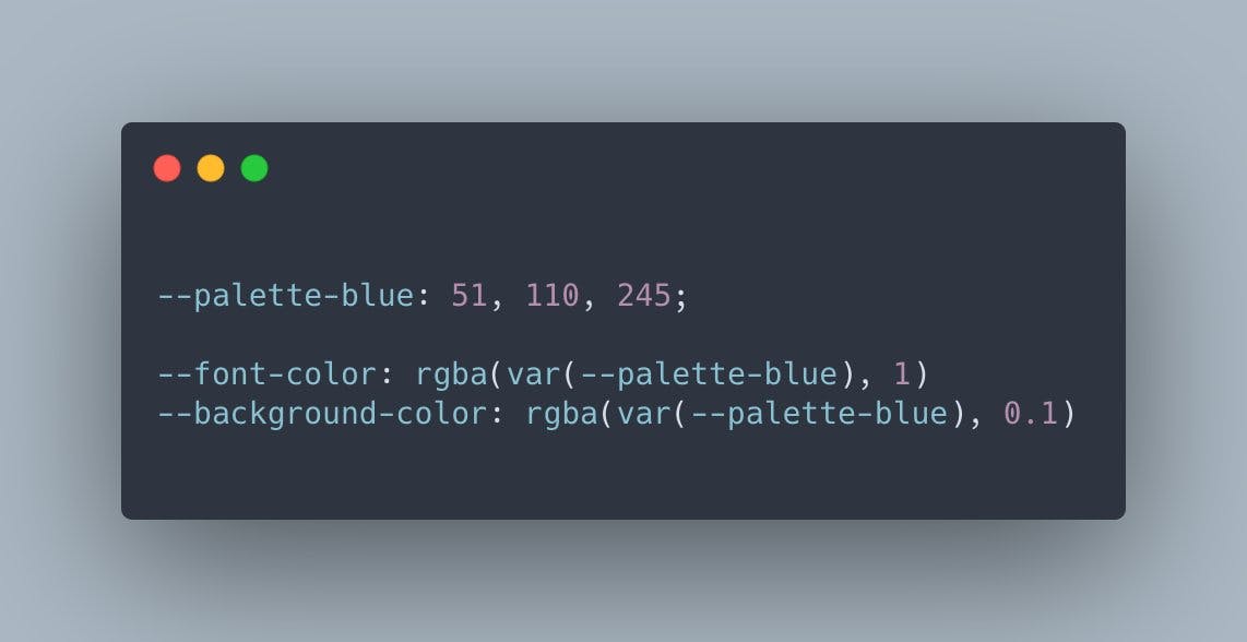
This is what highlighted the importance of having 2 sets of CSS variables: one for the "meaning" of a color the other one for the actual value of a color. I wanted my primary button component to have a "primary" background color, not necessarily a blue background color. Whether this primary color is blue, red or purple doesn't matter to me at the component level.
A specific use case I had for such separation of color variables was for colors with different opacities.
I wanted the background color of my callout cards and my highlighted text to be the same shade of blue as my primary blue but with an opacity of 8%. The main reason behind it was aesthetic and also it would play nicely with my dark mode.
I ended up defining a new color called --emphasis. It was composed of the same partial values as the --primary color variable.
How I organize my colors based on meaning
1--base-blue: 222, 89%; /* All my colors here share the same hue and saturation */2/*3Here I declared my color palette.4Each color is a partial value5*/6--palette-blue-10: var(--base-blue), 10%;7--palette-blue-20: var(--base-blue), 20%;8--palette-blue-30: var(--base-blue), 30%;9--palette-blue-40: var(--base-blue), 40%;10--palette-blue-50: var(--base-blue), 50%;11--palette-blue-60: var(--base-blue), 60%;12--palette-blue-70: var(--base-blue), 70%;13--palette-blue-80: var(--base-blue), 80%;14--palette-blue-90: var(--base-blue), 90%;15--palette-blue-100: var(--base-blue), 100%;16/*17Here I compose a color based on its meaning:18- primary and emphasis are composed by using --palette-blue-5019- they use a different opacity level thus they have different meaning:20- primary is a bold color used for buttons and primary CTA21- emphasis is used to highlight content or for the background of my callout cards22*/23--primary: hsla(var(--palette-blue-50), 100%);24--emphasis: hsla(var(--palette-blue-50), 8%);
Doing so enabled 2 things for me:
- It made it possible to define 2 different color variables that inherit from the same partial value thus creating some hierarchy.
- It made the style of my components more generic/abstract: if I'd decide to change the primary color, or implement a theme picker for my readers for instance, all my components would pretty much adapt to whatever the new primary color would be without having to do any extra work.
Still not convinced by this pattern? Want to see it in action? Well, you're in luck! I rebuilt the Twitter theme picker as a demo for you to play with just below 👇. This demonstrate how easy it is to define themes for your apps by applying the composition pattern and also separating color variables into the 2 sets we just saw!
All the main colors of my blog inherit from that single variable with a different lightness or/and opacity! Hence, by clicking on one of these "primary colors" we're updating the hue and saturation variables that compose my primary color (the blue I used on my blog a bit everywhere) thus changing any color that depend on these values.
Advanced composition patterns
As I'm writing these words I'm still heavily iterating on this pattern and see how far I can push it. One aspect that I'm interested in particular, is minimizing the number of CSS variables declared. In an ideal world, all I'd need is the base color, and from there I could extrapolate all the colors I need to through composition. All that without having to declare a full color palette!
What's the use case for this? you may ask. Well let's imagine the following scenario:
- my app has a main theme that has a
--base-primaryvariable defining the hue and saturation of the main primary color - a button within that app has a background color composed of
--base-primaryand a lightness of50% - The hover and focus color for that button are respectively the primary color 10% and 20% darker and are defined through composition
- But also, my app allows my users to pick any primary color of their choice: this means a different hue, saturation but also lightness
Button component using CSS variables defined by composition of partial values
1/**2Our set of CSS variables in this case is as follows:3--base-primary: 222, 89%;4--primary: hsla(var(--base-primary), 50%, 100%);5--primary-hover: hsla(var(--base-primary), 40%, 100%);6--primary-focus: hsla(var(--base-primary), 30%, 100%);7--text-color: hsla(0, 0%, 100%, 100%);8**/9const StyledButton = styled('button')`10height: 45px;11border-radius: 8px;12box-shadow: none;13border: none;14padding: 8px 16px;15text-align: center;16color: var(--text-color);17background-color: var(--primary);18cursor: pointer;19font-weight: 500;20&:hover {21background-color: var(--primary-hover);22}23&:focus {24background-color: var(--primary-focus);25}26`;
So far in all our examples, all the colors were defined based on a lightness of 50%. That includes the hover and focus color of our example above. If the user picks a color with a lightness different than 50% that's where things start to be complicated...
With what we've seen so far, it's easy to just throw a bunch of CSS variables at the problem and call it a day. However, I wanted to see if there was a better solution for it. So I revisited the way I composed my primary color in the first place:
- I'd define a
--base-primaryas before containing the hue and the saturation of my default primary color - I'd define a
--base-primary-lightnesscontaining the base lightness of the primary color - calculate the lightness for the hover and focus background colors of my button
Below you can see an example implementation: a "themed" button that only has one set of CSS variables in its implementation for its different background colors.
Since they are composed and since the lightness is calculated based on a "base lightness", changing the color of the button should give you an equivalent hover and focus color respectively 10% and 20% darker no matter the color. Try it out yourself!
import { styled } from '@stitches/react';
import './scene.css';

const StyledButton = styled('button', {
    height: '45px',
    borderRadius: '8px',
    boxShadow: 'none',
    border: 'none',
    padding: '8px 16px',
    textAlign: 'center',
    color: 'var(--text-color)',
    backgroundColor: 'var(--primary)',
    cursor: 'pointer',
    fontWeight: '500',
    '&:hover': {
      backgroundColor: 'var(--primary-hover)',
    },
    '&:focus': {
      backgroundColor: 'var(--primary-focus)',
    },
  });

  /**
    You can try to modify the lightness or base hue/saturation below.
    You should see that the button hover and focus color will adapt and take into account
    almost (see below why) any color!
  **/
  const BlueThemeWrapper = styled('div', {
    '--base-primary': '222, 89%',
    '--base-primary-lightness': '50%',
    '--primary': 'hsla(var(--base-primary), var(--base-primary-lightness), 100%)',
    '--primary-hover': `hsla(
      var(--base-primary),
      calc(var(--base-primary-lightness) - 10%),
      /* --primary-hover is --primary but 10% darker */ 100%
    )`,
    '--primary-focus': `hsla(
      var(--base-primary),
      calc(var(--base-primary-lightness) - 20%),
      /* --primary-hover is --primary but 20% darker */ 100%
    )`,
    '--text-color': 'hsla(0, 0%, 100%, 100%)',
  });

  const CyanThemedWrapper = styled('div', {
    '--base-primary': '185, 75%',
    '--base-primary-lightness': '60%',
    '--primary': 'hsla(var(--base-primary), var(--base-primary-lightness), 100%)',
    '--primary-hover': `hsla(
      var(--base-primary),
      calc(var(--base-primary-lightness) - 10%),
      100%
    )`,
    '--primary-focus': `hsla(
      var(--base-primary),
      calc(var(--base-primary-lightness) - 20%),
      100%
    )`,
    '--text-color': 'hsla(0, 0%, 100%, 100%)',
  });

  const RedThemeWrapper = styled('div', {
    '--base-primary': '327, 80%',
    '--base-primary-lightness': '40%',
    '--primary': 'hsla(var(--base-primary), var(--base-primary-lightness), 100%)',
    '--primary-hover': `hsla(
      var(--base-primary),
      calc(var(--base-primary-lightness) - 10%),
      100%
    )`,
    '--primary-focus': `hsla(
      var(--base-primary),
      calc(var(--base-primary-lightness) - 20%),
      100%
    )`,
    '--text-color': 'hsla(0, 0%, 100%, 100%)',
  });


const Test = () => {
  return (
    <div
      style={{
        display: 'flex',
        flexDirection: 'column',
        justifyContent: 'space-between',
        height: '175px',
      }}
    >
      <BlueThemeWrapper>
        <StyledButton>Primary Button</StyledButton>
      </BlueThemeWrapper>
      <CyanThemedWrapper>
        <StyledButton>Primary Button</StyledButton>
      </CyanThemedWrapper>
      <RedThemeWrapper>
        <StyledButton>Primary Button</StyledButton>
      </RedThemeWrapper>
    </div>
  );
}

export default Test;
This technique above is pretty cool but it has its limits:
- if the user defines a color that's too dark, the hover and focus background colors won't be visible. You can try it out above by modifying the
--base-primary-lightnessof one of the themes to5%. - another issue would happen if the color is too light: our text is white on the button, and we would need to take this into account. You can try it out above by modifying the
--base-primary-lightnessof one of the themes to95%.
I could easily solve these issues by using SaaS, but I would really love to continue relying only on CSS as far as possible, especially to keep my stack simple. For now, I'll simply handle these use-cases on the client. I'm still using CSS-in-JS after all, and this is where I feel it can shine.
Conclusion
I hope you liked these little CSS composition techniques, and maybe this pattern will click for you the same way it clicked for me 😄. Implementing these on my own websites, including this blog, has been quite an improvement, and has helped me simplify my stack and my code a lot!
So far, I only applied this composition pattern to colors, obviously you could pretty much apply it to any CSS properties. Colors and color variables management was just such a huge problem for me that was solved thanks to this that I felt it was big enough of a use-case to write this article.
If you have any suggestions or ideas on how to push this pattern even further, please let me know! I'm still experimenting with it and would love to hear what you come up with!