The Art of Dithering and Retro Shading for the Web
I spent the past few months building my personal website from the ground up, finally taking the time to incorporate some 3D work to showcase my shader and WebGL skills. Throughout this work, I got to truly understand the crucial role that post-processing plays in making a scene actually look good, which brought some resolutions to long-term frustrations I had with my past React Three Fiber and shader projects where my vision wouldn't materialize regardless of the amount of work and care I was putting into them.
Taking the time to build, combine, and experiment with custom post-processing effects gave me an additional creative outlet, and among the many types I got to iterate on, I always had a particular affection for the several "retro" effects I came up with. With subtle details such as dithering, color quantization, or pixelization/CRT RGB cells, they bring a pleasant contrast between the modern web landscape and a long-gone era of technology we 90s/early 2000s kids are sometime longing for.
Given the time I invested dissecting every aspect of these effects, I wanted to dive deep with you into the concepts powering them and the shader techniques I learned along the way. In this article, I hope to convince you of the power of post-processing effects and that nothing beats an elegant retro vibe applied to a website 👌✨. We'll also look into examples of dithering and pixel art from very talented folks who use the same processes that I'll be introducing later on, as well as some of my own creations that I built while learning about all this.
Dithering originated as an early graphics technique to trick the viewer's brain into seeing more color or smoothness in gradients/shadows that the machines back in the day could output by intentionally introducing noise on top of an image or a render. Color palettes were very limited back then, thus relying on techniques like these was vital for game designers to realize their vision. This gave, as a result, a unique look and feel to games and media from that specific moment in time where computers became ubiquitous, but advanced graphic capabilities were not yet there.
Today, dithering is more an artistic choice than a workaround. Many artists or game designers use this technique as a creative outlet to give their work a unique retro vibe, calling out to that early gaming era, or work within the realms of self-imposed limits in colors. Some great examples of such use of dithering include:
- Basement Studio's Basement Chronicle game: a well-executed point-and-click game that reminds me a lot of my own early gaming experience.
- @loackme's art, which I'm an absolute fan of.
- @aweusmeuh's use of the original Game Boy camera for experimental photography which features a sublime dithering effect.
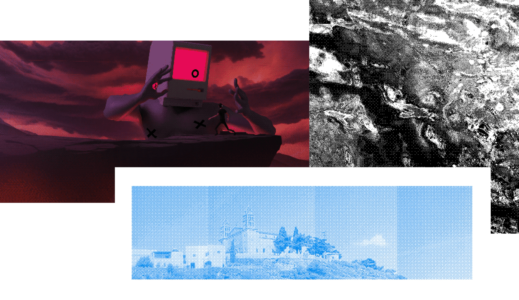
The latter is how we will approach dithering in this blog post: to give our React Three Fiber/Three.js projects a unique style! In this first part, we'll explore how the dithering technique works, implement it as a shader, and build a first iteration of a custom dithering post-processing effect that we can apply on top of any 3D scene.
A first pass at dithering in React Three Fiber
For this project, we'll create a custom post-processing effect. As we did for the Moebius stylized shader, relying on post-processing will allow us to apply a shader to an already rendered scene and alter its style like adding an "image filter" to a photo.
To create a custom effect, we will:
- Declare a class that extends from
Effect - Define our fragment shader and call it from the parent constructor using the
superkeyword. - Define the set of uniforms we will need for our effect.
- Call the
wrapEffectfunction from@react-three/post-processingwith our effect class as an argument. This will allow us to use our effect as a JSX component withinEffectComposer.
Sample custom shader post-processing effect used in an R3F scene
1import { OrbitControls, OrthographicCamera, useFBO } from '@react-three/drei';2import { Canvas } from '@react-three/fiber';3import { wrapEffect, EffectComposer } from '@react-three/postprocessing';4import { Effect } from 'postprocessing';5import { Suspense, useRef, useState } from 'react';6import { v4 as uuidv4 } from 'uuid';78import fragmentShader from './fragmentShader.glsl';910class RetroEffectImpl extends Effect {11constructor() {12super('RetroEffect', fragmentShader, {13uniforms: new Map([]),14});15}16}1718const RetroEffect = wrapEffect(RetroEffectImpl);1920const Retro = () => {21const mesh = useRef();2223return (24<>25<mesh receiveShadow castShadow>26<torusKnotGeometry args={[1, 0.25, 128, 100]} />27<meshStandardMaterial color="cyan" />28</mesh>29<EffectComposer>30<RetroEffect />31</EffectComposer>32</>33);34};
As a first step to building our effect, we'll start with a simple luminance-based white noise dithering. The idea behind this is to:
- Look at the luminance of each pixel.
- Compare it to a random number (hence the "white noise" in the name).
- Output a white or black pixel based on whether the luminance falls above or below said random number.
White noise dithering implemented in a fragment shader of a custom effect
1float random(vec2 c) {2return fract(sin(dot(c.xy, vec2(12.9898, 78.233))) * 43758.5453);3}45vec3 whiteNoiseDither(vec2 uv, float lum) {6vec3 color = vec3(0.0);78if (lum < random(uv)) {9color = vec3(0.0);10} else {11color = vec3(1.0);12}1314return color;15}1617void mainImage(const in vec4 inputColor, const in vec2 uv, out vec4 outputColor) {18vec4 color = texture2D(inputBuffer, uv);1920float lum = dot(vec3(0.2126, 0.7152, 0.0722), color.rgb);21color.rgb = whiteNoiseDither(uv, lum);2223outputColor = color;24}
You can observe the effect that this code would yield on the widget below which re-implements a similar process:
Doing this will result in a grayscale version of our scene where any pixel not purely black or white will be dithered tricking our brains into seeing more shades of gray. The demo below shows the effect applied on top of a simple React Three Fiber scene:
Ordered Dithering and Bayer Matrix
The effect we just built works, but it relies on white noise for its dithering threshold, leading to a messy result. We can bring order to all this (🥁) using a technique commonly known as ordered dithering due to the ordered pattern it yields when applied.
This technique relies on a threshold map defined via a Bayer Matrix that contains values used to determine whether we should adjust the color of a given pixel to black or white.
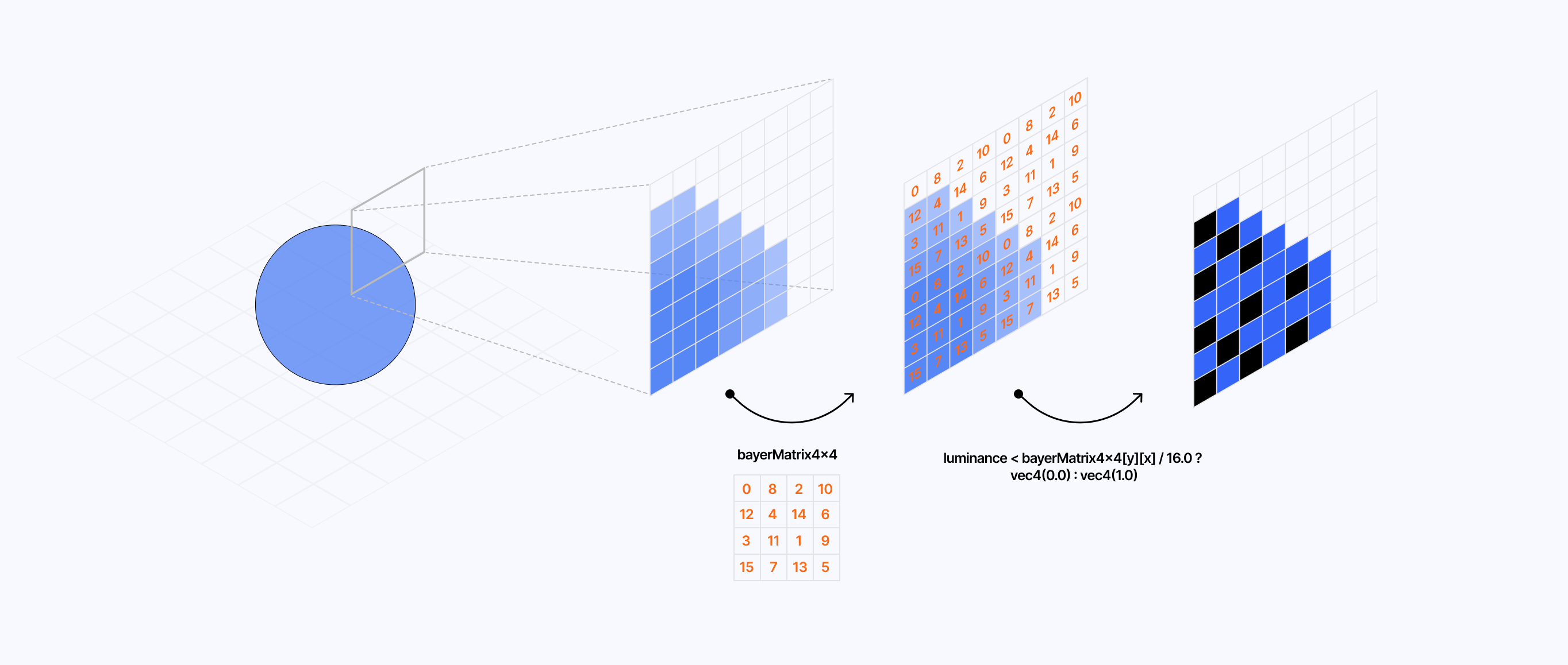
To demonstrate how this dithering type works, I built the widget below where you can see how this matrix changes the output of a grid of pixels once applied on top of it:
As you can see through the examples I showcased above, we get some pretty distinct dithering patterns based on
- the shades of gray used in the underlying pixel grid
- the size of the Bayer Matrix used to get the threshold value


To implement this in GLSL, we need to get the luminance of each pixel and compare its value with the corresponding threshold value for that same pixel obtained from the Bayer Matrix:
- if the difference between those values is positive, the pixel is white
- otherwise, it is black
Ordered dithering using a 4x4 Bayer Matrix
1const mat4x4 bayerMatrix4x4 = mat4x4(20.0, 8.0, 2.0, 10.0,312.0, 4.0, 14.0, 6.0,43.0, 11.0, 1.0, 9.0,515.0, 7.0, 13.0, 5.06) / 16.0;78vec3 orderedDither(vec2 uv, float lum) {9vec3 color = vec3(0.0);1011float threshold = 0.0;1213int x = int(uv.x * resolution.x) % 4;14int y = int(uv.y * resolution.y) % 4;15threshold = bayerMatrix4x4[y][x];1617if (lum < threshold + bias) {18color = vec3(0.0);19} else {20color = vec3(1.0);21}2223return color;24}
Modifying the effect code we implemented in the previous part with the code we just introduced will give us an ordered dithering effect for our underlying scene:
Blue noise dithering
We got ourselves a satisfying ordered dithering effect! While this is the most popular dithering technique, as well as the main one we'll leverage in this article, I still wanted to touch upon an additonal way to dither that you perhaps remember seeing in my article on Volumetric Raymarching: blue noise dithering.
I used this technique in my raymarched cloud scenes to "erase the banding or layering effect due to a less granular [raymarching] loop" which funny enough is the same use case we need dithering for in our Retro post-processing effect. Unlike the previous techniques, this one relies on a texture that we'll pass to the shader of our custom post-processing effect via a uniform and then sample it as follows:
1vec4 noise = texture2D(uNoise, gl_FragCoord.xy / 128.0);2float threshold = noise.r;
where 128.0 is the width/height of said texture. We also define the threshold as the red color channel of the resulting noise color we obtain from the sampling, given that we're using a grayscale texture, it doesn't matter much which value you pick.
Below is the resulting output when we use a blue noise texture to obtain our dithering threshold value:
As you can see, it feels less repetitive and structured than ordered dithering while also not being as random as white noise dithering; a nice middle ground.
So far, all our dithering examples also converted the underlying scene to black and white, thus making us lose a lot of information and color. That is because:
- We calculated our dithering threshold based on the pixel luminance, thus relying on a grayscale version of our scene.
- We manually returned a black or white pixel based on the threshold value relative to the luminance.
That technique is commonly referred to as luminance-based dithering and the color conversion used here compresses the color palette to 2-bit: each pixel of the resulting scene with our post-processing effect applied is either black or white, and any shade in-between appears to us through dithering.
This color compression is known as color quantization, and it supports more than just black and white pixels as we'll see in this section.
Shades of gray and colors
Manually setting the colors of our dithering pattern can quickly get out of hand, especially with large color palettes. Instead, to get more than just a black or white pixel and leverage shades of gray, we'll use a formula to find the nearest neighboring color of a given pixel color based on the total number of colors we want to output in our effect:
floor(color * (n - 1) + 0.5)/n - 1 where n is the total number of color.
For example, if we wanted only two colors in our final color palette we would get a value of:
vec3(0.0)for the colorvec3(0.3)i.e. blackvec3(1.0)for the colorvec3(0.6)i.e. white
If we were to increase the number of colors we would get more shades of gray in the case of our grayscale scene.
Grayscale color quantization implemented in our custom effect
1vec3 dither(vec2 uv, float lum) {2vec3 color = vec3(lum);34int x = int(uv.x * resolution.x) % 8;5int y = int(uv.y * resolution.y) % 8;6float threshold = bayerMatrix8x8[y * 8 + x];78color.rgb += threshold;9color.r = floor(color.r * (colorNum - 1.0) + 0.5) / (colorNum - 1.0);10color.g = floor(color.g * (colorNum - 1.0) + 0.5) / (colorNum - 1.0);11color.b = floor(color.b * (colorNum - 1.0) + 0.5) / (colorNum - 1.0);1213return color;14}


This formula doesn't just work for shades of gray, we can use it directly on the original pixel color to compute its nearest neighbor:
- for a two-color palette, we'll get the 2 possible values for each color channel thus 2^3 = 8 colors
- for a four-color palette, it would be 4^3 = 64 colors
Color quantization implemented in our custom effect
1vec3 dither(vec2 uv, vec3 color) {2int x = int(uv.x * resolution.x) % 8;3int y = int(uv.y * resolution.y) % 8;4float threshold = bayerMatrix8x8[y * 8 + x];56color.rgb += threshold;7color.r = floor(color.r * (colorNum - 1.0) + 0.5) / (colorNum - 1.0);8color.g = floor(color.g * (colorNum - 1.0) + 0.5) / (colorNum - 1.0);9color.b = floor(color.b * (colorNum - 1.0) + 0.5) / (colorNum - 1.0);1011return color;12}
This quantization technique lets us approximate the look and feel of older graphics. We can obtain color palettes that are more in line with what computers and consoles could output back in the day.
Custom color palettes
We now know a technique to reduce the number of colors in our final render to an arbitrary number, but what about reducing it to an arbitrary set of colors?
In his video on quantization and dithering, @Acerola_t introduces a technique to do just that by using the value of a grayscale color palette to sample a texture defining a custom color palette.
For example, if our last grayscale example scene from earlier sets the color number to four, we will get the following grayscale values:
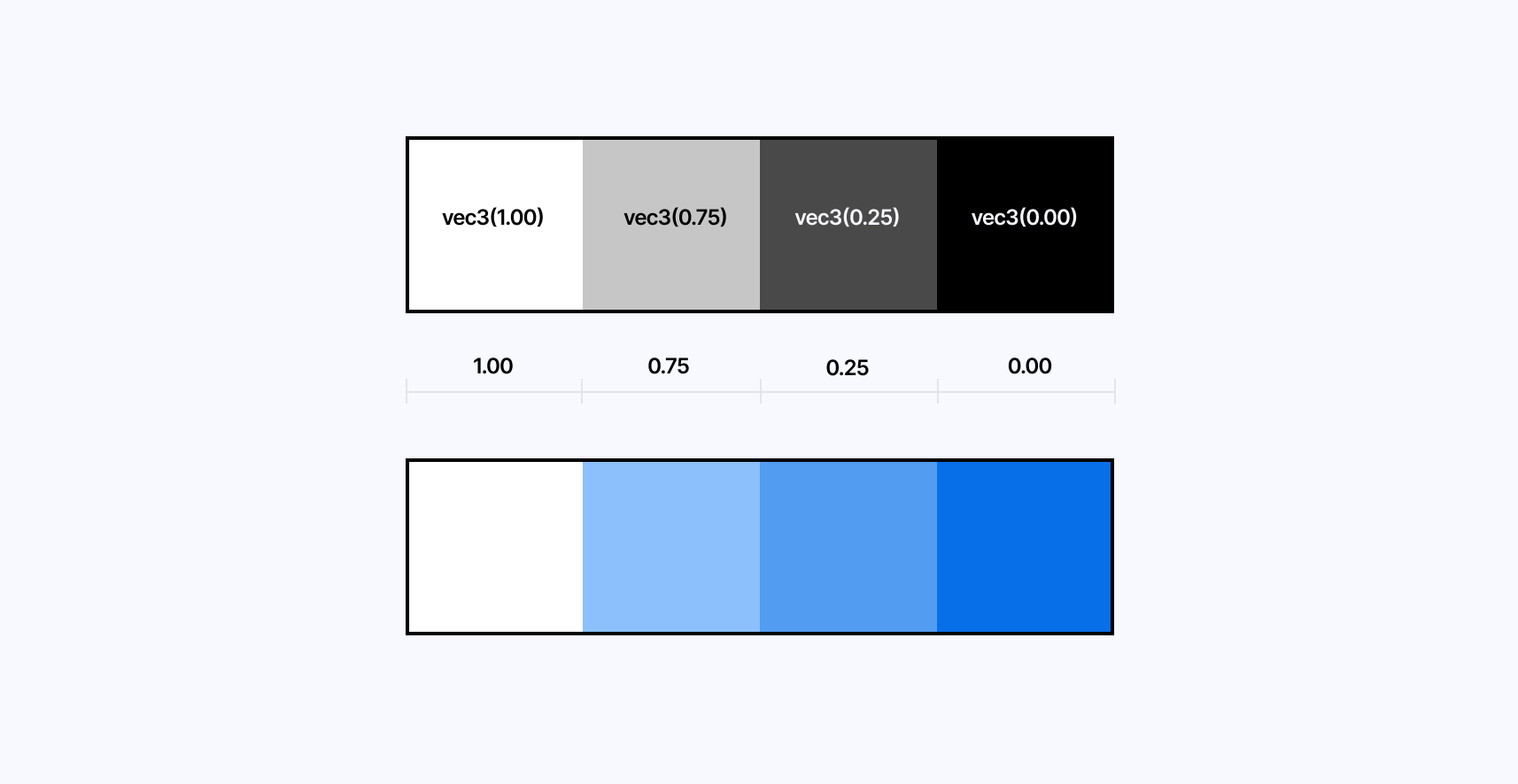
These values correspond to the horizontal values of the UV coordinates of our color palette texture, thus letting us use those values to sample the texture and get the custom colors from it:
Using quantization grayscale value to sample custom color palette texture"
1vec3 {13} dither(vec2 uv, float lum) {2vec3 color = vec3(lum);34int x = int(uv.x * resolution.x) % 8;5int y = int(uv.y * resolution.y) % 8;6float threshold = bayerMatrix8x8[y * 8 + x];78color.rgb += threshold * 0.2;9color.r = floor(color.r * (4.0 - 1.0) + 0.5) / (4.0 - 1.0);10color.g = floor(color.g * (4.0 - 1.0) + 0.5) / (4.0 - 1.0);11color.b = floor(color.b * (4.0 - 1.0) + 0.5) / (4.0 - 1.0);1213vec3 paletteColor = texture2D(palette, vec2(color.r)).rgb;1415return paletteColor;16}
If we were to apply that technique to the previous scene, this is what the final output would look like:
I'd encourage you to fork this demo and try with:
- different textures
- different number of colors
The only thing to pay attention to is to keep the number of color blocks in your palette texture the same as the number of color you set in your custom effect.
Hue-lightness-based color quantization
In his article Dithering on the GPU Alex Charlton introduces an alternative color quantization technique. Instead of using the quantization formula we introduced at the beginning of this section, he relies on the hue of a color to find its closest neighboring colors from an arbitrary palette and the lightness of those colors to obtain the ordered dithering pattern.
To do so, he proceeds as follows:
- For each pixel, convert the color to HSL (Hue Saturation Lightness).
- Find its two closest neighbors in "hue" from the arbitrary color palette defined statically or provided via a uniform.
- Get the distance between the pixel and its closest color over the distance between the previously obtained colors.
- Compare this distance with the threshold value from the Bayer Matrix and, based on the result pick the first or second closest color.
- Get the distance between the two closest lightness that match the original pixel's color.
- Compare this distance with the threshold value from the Bayer Matrix and, based on the result pick the first or second lightness to set in the final color.
I vividly recommend taking the time to read the full article as it goes in-depth into an original and more artistic dithering process. Below you'll find the demo I re-implemented from the process showcased in the article. It also features some of the missing functions the author did not include in their post.
We now know how to:
- Reduce the number of colors of a given scene to a specific number or an arbitrary color palette.
- Use dithering to get back some of the details of the scene in the form of a dithering pattern like shadows or color gradients.
In this section, we will look at some techniques to downsample the final output of our scene to get a more pixelated look and see our dithering and quantization process shine at lower resolutions.
The key to getting a pixelated version of our original scene is to remap the UV coordinate system used in our effect shader and snap it to a grid so, once sampled, the texture from our input buffer appears as if it were at a lower resolution.
Pixelating a texture in GLSL
1void mainImage(const in vec4 inputColor, const in vec2 uv, out vec4 outputColor) {2vec2 normalizedPixelSize = pixelSize / resolution;3vec2 uvPixel = normalizedPixelSize * floor(uv / normalizedPixelSize);45vec4 color = texture2D(inputBuffer, uvPixel);6color.rgb = dither(uvPixel, color.rgb);78outputColor = color;9}
In the code snippet above:
- We define the size of our pixel via the
pixelSizeuniform. - We divide this value by the resolution of our scene to convert it to a normalized texture coordinate ranging from 0 to 1.
- We snap the UV coordinate to the grid defined by
uv/normalizedPixelSizeusing thefloorfunction. - We rescale the snapped UV coordinates to the original UV space by multiplying the result by
normalizedPixelSize.
The demo below adds this process along with an additional uniform for you to tweak the pixel size used in our scene:
Notice how the higher the value of pixelSize is, the more pixelated our scene becomes.
On top of that, we can see that our dithering pattern becomes less and less visible as the pixel size increases: there are not enough pixels in the final output to get any pattern at all. We'll have to strike the right balance between dithering pattern and pixel size to get the most compelling effect.
With this added to our effect, we have all the ingredients to produce gorgeous pixel art pieces or pixelated 3D scenes! One thing I immediately tried upon wrapping up this post-processing effect was to try it on top of some of my earlier shader work, like in my scene titled Dithering Waves where I applied a grayscale version of it on top of a simple scene rendering a domain wrapping texture using Fractal Brownian Motion, inspired by Inigo Quilez' article on the matter.
To experiment with contrasting aesthetics, I also wanted to try out ordered dithering and color quantization on some of my Raymarching work from last year. The ordered pattern contrasts nicely with the more organic nature of some of those scenes, especially at lower resolutions. Below are two examples that I particularily enjoyed:
While pixelization brings us one step closer to an accurate retro post-processing effect, there is one essential aspect of this effect that's missing: emulating the look of a good ol' CRT monitor.
CRTs work differently than our current displays. Thus, the best we can do here is to approach the look and feel of those old monitors by stacking a series of effects in our custom shader effect. The first and most fundamental effect that we'll work on, that also highlights the inner workings of CRTs, is the RGB cell pattern from the display.
RGB Cells
First and foremost, let's look at how CRT displays work so we can reproduce the effect as accurately as possible. Those monitors have 3 electron guns for each of the color channels (red, green, and blue) that run across the screen and excite their corresponding phosphors, which in return emit light to form an image. To prevent those beams from hitting the wrong phosphor dots and causing color issues on the final image, CRTs use a shadow mask with a metal plate made of tiny holes. They can have many different configurations which yield different mask types.
In this section, we'll attempt to emulate the Schiltzmaske: an aperture grill where each column is staggered by half a cell height.
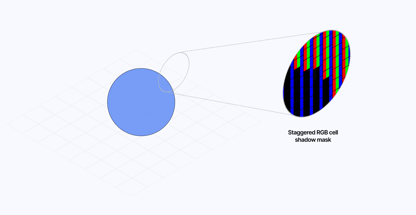
This implementation could also allow us to try to get another mask type called Streifermaske, which is similar except that it does not feature the staggered cells and only features a mask on its column.
The implementation of such a "pixel pattern" in GLSL goes as follows:
- We first need to define our RGB cells and their subcells: a slot for each red, green, and blue channel.
1vec2 pixel = uv * resolution;2vec2 coord = pixel / pixelSize;3vec2 subcoord = coord * vec2(3,1);4vec2 cellOffset = vec2(0, mod(floor(coord.x), 3.0) * 0.5);
- We create a cell "offset" for every two cells: some will have an offset of
vec2(0.0)and some ofvec2(0.0, 0.5), thus creating the vertical staggered effect of our shadow mask.
1vec2 cellOffset = vec2(0, mod(floor(coord.x), 3.0) * 0.5);
- We pick which subcell the current pixel belongs to and output the corresponding subcell color based on the subcell index.
1float ind = mod(floor(subcoord.x), 3.0);2vec3 maskColor = vec3(ind == 0.0, ind == 1.0, ind == 2.0) * 2.0;
- We now need to draw the borders of our masks. The first step is to create a set of UV coordinates for each subcell, then make a border vector that gets higher values in the edges of each subcell and lower towards the center. Finally, we blend the result with the current mask color, thus creating a colored subcell with a border.
1vec2 cellUv = fract(subcoord + cellOffset) * 2.0 - 1.0;2vec2 border = 1.0 - cellUv * cellUv * MASK_BORDER;3maskColor.rgb *= border.x * border.y;
- The last step is to create a
rgbCellUVvector that we can use to sample the input buffer of our underlying scene and map it in this new CRT RGB Cell coordinate system.
1vec2 rgbCellUV = floor(coord+cellOffset) * pixelSize / resolution;
This results in a more accurate look and feel for a retro post-processing effect. Those are the types of details that can make the whole difference when making a 3D scene for the web.

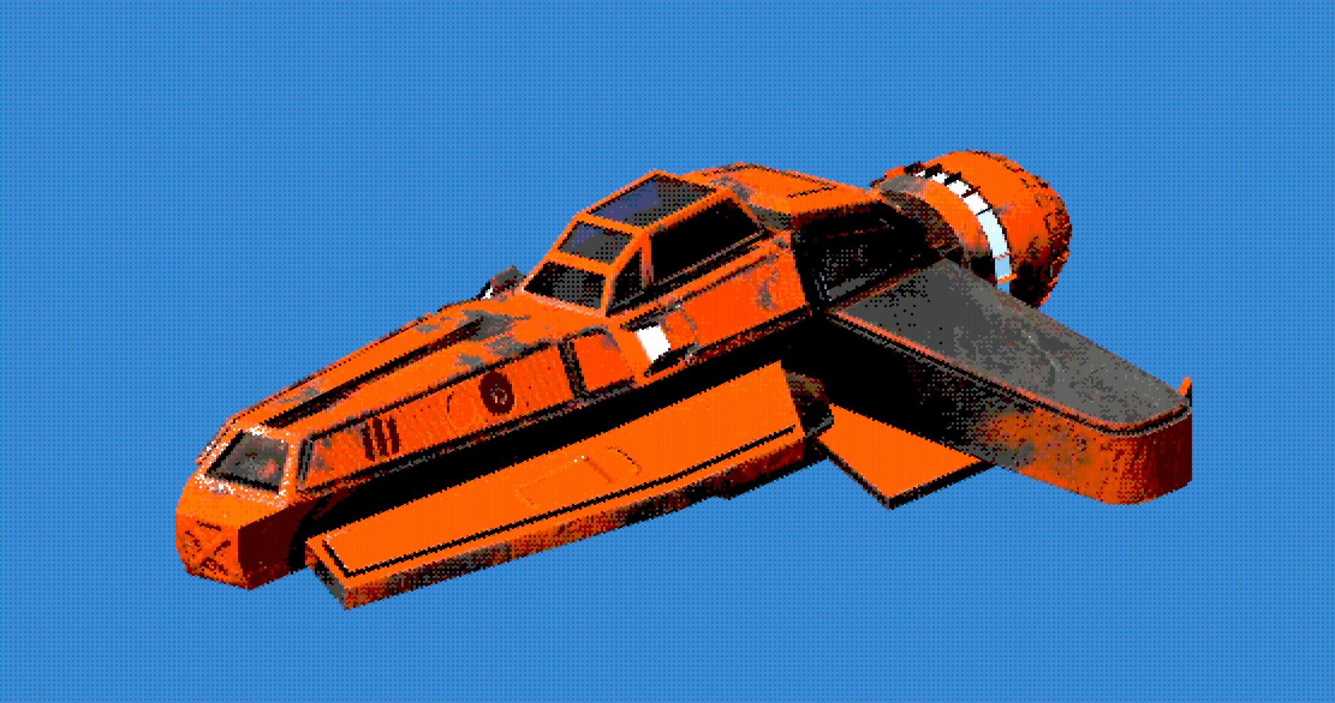
The demo below fully implements the process highlighted above, which yields a beautiful and soft CRT effect. Setting a high pixel size will also allow you to admire our subcells at work, lighting up individually based on the color of the underlying scene.
Curving the display
CRTs were not flat like their LCD counterparts. Instead, they featured some slight curvature which we can emulate with a few lines of GLSL. To do so, much like we just did for our RGB cells shadow mask, we can remap our UV coordinates to introduce some curvature:
Modifying our UVs to introduce curvature to our effect
1void mainImage(const in vec4 inputColor, const in vec2 uv, out vec4 outputColor) {2vec2 curveUV = uv * 2.0 - 1.0;3vec2 offset = curveUV.yx * curve;4curveUV += curveUV * offset * offset;5curveUV = curveUV * 0.5 + 0.5;67//...8}
In the code snippet above:
- We convert our UV coordinates range to a new range of
[-1, 1]as we want the curvature to be centered relative to the screen. - Swapping the x and y components of our UV coordinates and multiplying by a
CURVE_INTENSITYvariable lets us define the strength/offset of our curvature. In this case, the offset will be stronger at the corners and not as strong as we reach the center of both the x and y-axis. - Finally, we want our curvature to be quadratic, i.e. stronger the closer we get to the fringes of the screen. We then convert the resulting UV coordinates back to a range of
[0, 1]allowing us to use it in our shader as the base UVs.
Using those new UV coordinates, we can draw the edges of our CRT using smoothstep:
Drawing edges of our curved CRT using curveUV
1vec2 edge = smoothstep(0., 0.02, curveUV)*(1.-smoothstep(1.-0.02, 1., curveUV));2color.rgb *= edge.x * edge.y;
This gives us black curved edges on the top, bottom, left, and right sides of the display. The demo below implements this curvature element to the effect we've been iterating on since the beginning of this blog post and also lets you tweak the curvature intensity from 0 (flat) to 0.5 (realistically curved, anything higher than that is "too much").
Scanlines, distortion, and final touches
In this last part, I wanted to walk you through some of the final touches I added to my own retro post-processing effect to make it as accurate as possible.
One of the first tweaks I felt was necessary was to add some slight chromatic aberration when sampling the input buffer of our effect, which we can find the code of in Refraction, dispersion, and other shader light effects. Due to the screen curvature and some imperfect alignments of the electron beams of the CRT, it was frequent that color channels would appear slightly offset, yielding a slightly blurred image.
Arbitrary chromatic aberration applied to our effect
1void mainImage(const in vec4 inputColor, const in vec2 uv, out vec4 outputColor) {23//...4vec4 color = vec4(1.0);5color.r = texture2D(inputBuffer, rgbCellUV + SPREAD).r;6color.g = texture2D(inputBuffer, rgbCellUV).g;7color.b = texture2D(inputBuffer, rgbCellUV - SPREAD).b;89color.rgb = dither(rgbCellUV, color.rgb);10//...11}
Moreover, due to the inner workings of CRTs we highlighted earlier, some Bloom may also occur. We can consider this using the Bloom component from @react-three/postprocessing.
Adding Bloom within our EffectComposer
1const Retro = () => {2const spaceship = useRef();3const effect = useRef();45return (6<>7<group rotation={[0, Math.PI / 2, 0]}>8<Spaceship ref={spaceship} />9</group>10<EffectComposer>11<RetroEffect ref={effect} />12<Bloom13intensity={0.25}14luminanceThreshold={0.05}15luminanceSmoothing={0.9}16/>17</EffectComposer>18</>19);20};
Finally, we can overlay the final output of our custom shader effect with horizontal scanlines running through the screen vertically:
Simple scanlines added on top of our effect output
1float lines = sin(uv.y * 2000.0 + time * 100.0);2color *= lines + 1.0;
We can also include some additional distortion to the UV coordinates of our effect by adding code to the mainUv function of our shader. Adding some slight imperfections like these can make our CRT look even more accurate. Below is a simple example, but feel free to further experiment with more complex distortion patterns:
Adding distortion in mainUv
1float noise (in vec2 st) {2vec2 i = floor(st);3vec2 f = fract(st);45float a = random(i);6float b = random(i + vec2(1.0, 0.0));7float c = random(i + vec2(0.0, 1.0));8float d = random(i + vec2(1.0, 1.0));910vec2 u = f*f*(3.0-2.0*f);1112return mix(a, b, u.x) +13(c - a)* u.y * (1.0 - u.x) +14(d - b) * u.x * u.y;15}1617void mainUv(inout vec2 uv) {18float shake = (noise(vec2(uv.y) * sin(time * 400.0) * 100.0) - 0.5) * 0.0025;19uv.x += shake * 1.5;20}
We're finally done! Or at least I was satisfied enough to make this the stopping point of this article, you can still experiment and continue to tweak this shader at your heart's content! You can admire the final version of our retro post-processing effect below, which includes:
- Color quantization to reduce the number of colors in our final output.
- Pixelization and RGB Cell shadow mask effect to create realistic downsampling typically visible in old CRT displays.
- Ordered Dithering which alleviates the low pixel and color count in the output image and gives us back some details of the underlying scene in the form of pixel patterns.
- Screen Curvature, scanlines with distortions, bloom, and chromatic aberration as final touches to make our effect pop.
Through the many examples and techniques we covered, I hope this article demonstrated how powerful custom shader effects are and how transformative they can be when applied on top of your own WebGL/3D work. This particular "Retro" effect is, of course, just a particular case of a beautiful effect you can build, a drop in the ocean of what's possible. The underlying dithering, quantization, and pixelization/RGB Cells that we learned about are applicable on their own as well as infinitely tweakable to make your work stand out in the ever-growing scene of 3D websites and digital art.
I'm looking forward to seeing what you will come up with now that you know pretty much everything I do on the matter (there are no excuses not to build!), there's a lot you can create by combining the effect and building blocks we've just seen. Meanwhile, I'll keep working through my endless list of shader techniques to study, and the many other post-processing effects and styles I'm trying to mimic. As always, I'll report back on my findings 😊.