Switching off the lights - Adding dark mode to your React app
Since the release of macOS Mojave, a lot of people have expressed their love for dark mode and a lot of websites like Twitter, Reddit or Youtube have followed this trend. Why you may ask? I think the following quote from this Reddit post summarizes it pretty well:
Night is dark. Screen is bright. Eyes hurt.
Night is dark. Screen is dark. Eyes not hurt.
As I want to see even more websites have this feature, I started experimenting with an easy a non-intrusive way to add a dark mode to my React projects, and this is what this article is about.
In this post, I’m going to share with you how I built dark mode support for a sample React app with Emotion themes. We’ll use a combination of contexts, hooks, and themes to build this feature and the resulting implementation should not cause any fundamental changes to the app.
Note: I use Emotion as a preference, but you can obviously use CSS modules or even inlines styles to implement a similar feature.
What we’re going to build:
The objective here is to have a functional dark mode on a website with the following features:
- a switch to be able to enable or disable the dark mode
- some local storage support to know on load if the dark mode is activated or not
- a dark and light theme for our styled components to consume
The first thing we will need for our dark mode is a definition of what it stands for color-wise. Emotion themes are very well adapted to do this. Indeed we can define all our dark mode colors and light mode colors in distinct files for example and have these colors use the same keys to be accessed. Below we can see an example of a theme I’m using in one of my projects and its dark equivalent.
The theme definitions for our example
1const white '#FFFFFF';2const black = "#161617";3const gray = "#F8F8F9";45const themeLight = {6background: gray,7body: black8};910const themeDark = {11background: black,12body: white13};1415const theme = mode => (mode === 'dark' ? themeDark : themeLight);1617export default theme;
You’ll notice in the code above that I gave very descriptive names to my variables such as background or body. I always try to make sure none of the variables names are based on the color so I can use the same name across the different themes I’m using.
Now that we have both our dark and light theme, we can focus on how we’re going to consume these themes.
This is the core component of this post. The Theme Provider will contain all the logic for our dark mode feature: the toggle function, which theme to load when your site renders the first time, and also, inject the theme to all your child components.
With the help of React Hooks and Context, it is possible with just a few lines of code and without the need to build any classes or HoC (Higher order Components).
Loading the state in Context
First, we need to define a default state for our Theme Provider. The two elements that define these states are:
- a boolean that tells us whether or not the dark theme is activated, defaults to
false. - a function toggle that will be defined later.
This state will be the default state in a ThemeContext, because we want to have access to these items across our all application. In order to avoid having to wrap any page of our app in a ThemeContext.Consumer, we’ll build a custom useTheme hook based on the useContext hook. Why hooks? I think this tweet summarizes it pretty well:
As it is stated in the tweet above, I really believe that hooks are more readable than render props:
Default state and ThemeContext
1const defaultContextData = {2dark: false,3toggle: () => {},4};56const ThemeContext = React.createContext(defaultContextData);7const useTheme = () => React.useContext(ThemeContext);89// ThemeProvider code goes here1011export { useTheme };
In this ThemeProvider component, we’ll inject both the correct theme and the toggle function to the whole app. Additionally, it will contain the logic to load the proper theme when rendering the app. That logic will be contained within a custom hook: useEffectDarkMode.
Code for the useEffectDarkMode custom hook
1const useEffectDarkMode = () => {2const [themeState, setThemeState] = React.useState({3dark: false,4hasThemeMounted: false,5});67React.useEffect(() => {8const lsDark = localStorage.getItem('dark') === 'true';9setThemeState({ ...themeState, dark: lsDark, hasThemeMounted: true });10}, []);1112return [themeState, setThemeState];13};
In the code above, we take advantage of both the useState and useEffect hook. The useEffectDarkMode Hook will set a local state, which is our theme state when mounting the app. Notice that we pass an empty array [] as the second argument of the useEffect hook. Doing this makes sure that we only call this useEffect when the ThemeProvider component mounts (otherwise it would be called on every render of ThemeProvider).
Code for the ThemeProvider component that provides both theme and themeState to the whole application
1import { ThemeProvider as EmotionThemeProvider } from 'emotion-theming';2import React, { Dispatch, ReactNode, SetStateAction } from 'react';3import theme from './theme';45const defaultContextData = {6dark: false,7toggle: () => {},8};910const ThemeContext = React.createContext(defaultContextData);11const useTheme = () => React.useContext(ThemeContext);1213const useEffectDarkMode = () => {14const [themeState, setThemeState] = React.useState({15dark: false,16hasThemeLoaded: false,17});18React.useEffect(() => {19const lsDark = localStorage.getItem('dark') === 'true';20setThemeState({ ...themeState, dark: lsDark, hasThemeLoaded: true });21}, []);2223return [themeState, setThemeState];24};2526const ThemeProvider = ({ children }: { children: ReactNode }) => {27const [themeState, setThemeState] = useEffectDarkMode();2829if (!themeState.hasThemeLoaded) {30/*31If the theme is not yet loaded we don't want to render32this is just a workaround to avoid having the app rendering33in light mode by default and then switch to dark mode while34getting the theme state from localStorage35*/36return <div />;37}3839const theme = themeState.dark ? theme('dark') : theme('light');4041const toggle = () => {42// toogle function goes here43};4445return (46<EmotionThemeProvider theme={theme}>47<ThemeContext.Provider48value={{49dark: themeState.dark,50toggle,51}}52>53{children}54</ThemeContext.Provider>55</EmotionThemeProvider>56);57};5859export { ThemeProvider, useTheme };
The code snippet above contains the (almost) full implementation of our ThemeProvider:
- If dark is set to true in localStorage, we update the state to reflect this and the theme that will be passed to our Emotion Theme Provider will be the dark one. As a result, all our styled component using this theme will render in dark mode.
- Else, we’ll keep the default state which means that the app will render in light mode.
The only missing piece in our implementation is the toggle function. Based on our use case, it will have to do the following things:
- reverse the theme and update the themeState
- update the dark key in the localStorage
Code for the toggle function
1const toggle = () => {2const dark = !themeState.dark;3localStorage.setItem('dark', JSON.stringify(dark));4setThemeState({ ...themeState, dark });5};
This function is injected in the ThemeContext and aims to toggle between light and dark mode.
In the previous part, we’ve implemented all the logic and components needed, now it’s time to use them on our app!
Since we’ve based our implementation on React Context, we can simply import the ThemeProvider and wrap our application within it.
The next step is to provide a button on the UI to enable or disable the dark mode. Luckily, we have access to all the things we need to do so through the useTheme hook, which will give us access to what we’ve passed to our ThemeContext.Provider in part two of this post.
Sample app wrapped in the ThemeProvider using the useTheme hook
1import React from 'react';2import styled from '@emotion/styled';3import { useTheme } from './ThemeContext';45const Wrapper = styled('div')`6background: ${(props) => props.theme.background};7width: 100vw;8height: 100vh;9h1 {10color: ${(props) => props.theme.body};11}12`;1314const App = () => {15const themeState = useState();1617return (18<Wrapper>19<h1>Dark Mode example</h1>20<div>21<button onClick={() => themeState.toggle()}>22{themeState.dark ? 'Switch to Light Mode' : 'Switch to Dark Mode'}23</button>24</div>25</Wrapper>26);27};2829export default App;
Considering we’re in the default state (light mode), clicking this button will call the toggle function provided through the ThemeContext which will set the local storage variable dark to true and the themeState dark variable to true. This will switch the theme that is passed in the Emotion Theme Provider from light to dark. As a result, all our styled components using that theme will end up using the dark theme, and thus our entire application is now in dark mode.
In the example above, the Wrapper component uses the colors of the theme for the fonts and the background, when switching from light to dark these CSS properties will change and hence the background will go from gray to black and the font from black to white.
We successfully added support for dark mode in our React application without having done any fundamental changes! I really hope this post will inspire others to add this feature to their own website or app in order to make them more easy on the eye when used during night time.
Moreover, this kind of feature is a great example of hook implementations and how to use the latest features of React to build amazing things.
I got this feature on my own website/portfolio and this is how it looks:
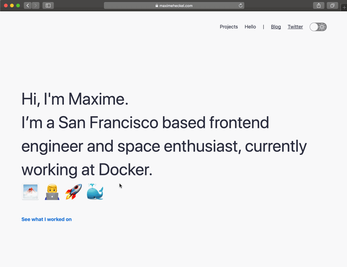
The dark mode implementation on my website (sorry for the low frame rate 😅).
If you want to get a sample project with dark mode to hack on top of it, check out this minimal React app I built with all the code showcased on this article.